
AAPC's new logo design replaced their old logo below.
AAPC needed a partner to be involved in rebranding the company and applying that new branding to a redesigned online architecture including the following key areas of their ecommerce site:
• Incorporate into the website redesign the new rebranded logo house hierarchy: corporate, software, Healthcare Business Monthly, HEALTHCON, AAPC Services application, new iconography, and images.
• Website look-and-feel for the homepage and various content funnel pages.
• Member Login landing page.
• Product/Education Information and detail pages: Certification products, Workshops, Webinars, Events, Coder, Medical Books, and Continuing Education Units (CEUs).
• AAPC Forum pages.
• eCommerce shopping cart and checkout process architecture and user experience.
• HEALTHCON.com architecture and user experience.
• Complete redesign of AAPC's monthly magazine, Healthcare Business Monthly, and its e-version.
• Dynamic HTML Banners in various sizes for Webinars, Services, and more.
• New Customer / Student / Prospect Welcome Center — decision tree flow funnel pages, user journey diagram, aptitude quiz steps, lead capture, calls to actions, and summary pages
• For Business/Organizations section — a different B2B audience.
This process was intended to take a seven (7) month timeline in the following phases: exploration, presentation of research analysis and findings, refinement rounds, high fidelity wireframes, and production deliverables. We had to adjust many of these deliverables due the Covid-19 world-wide pandemic and the economic impact the quarantine had on downsized business.
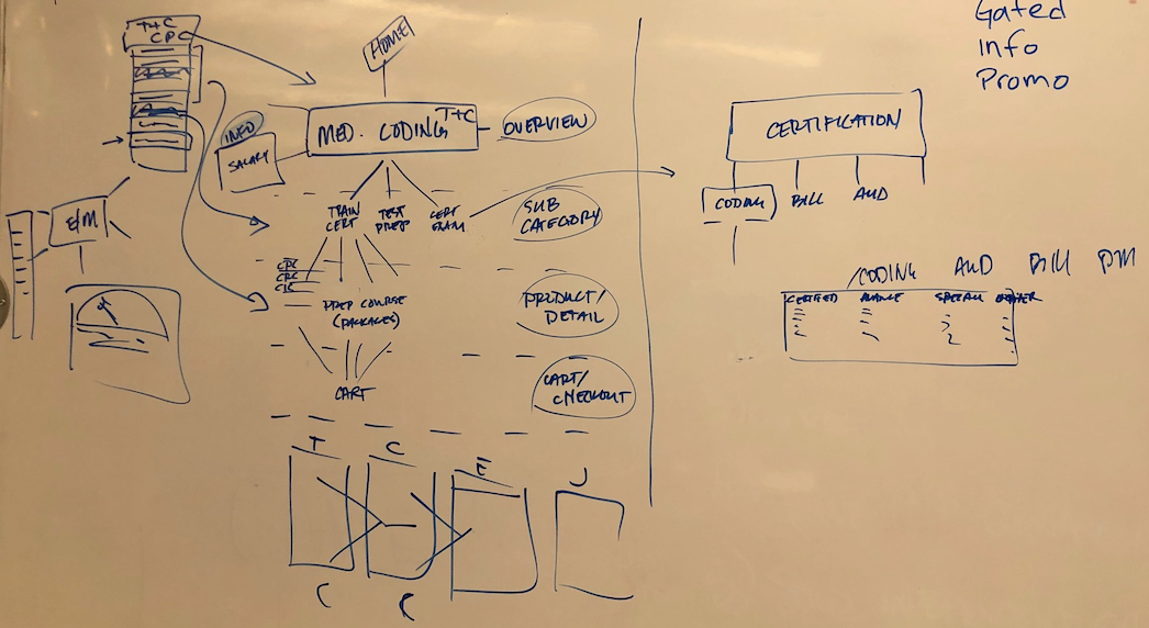
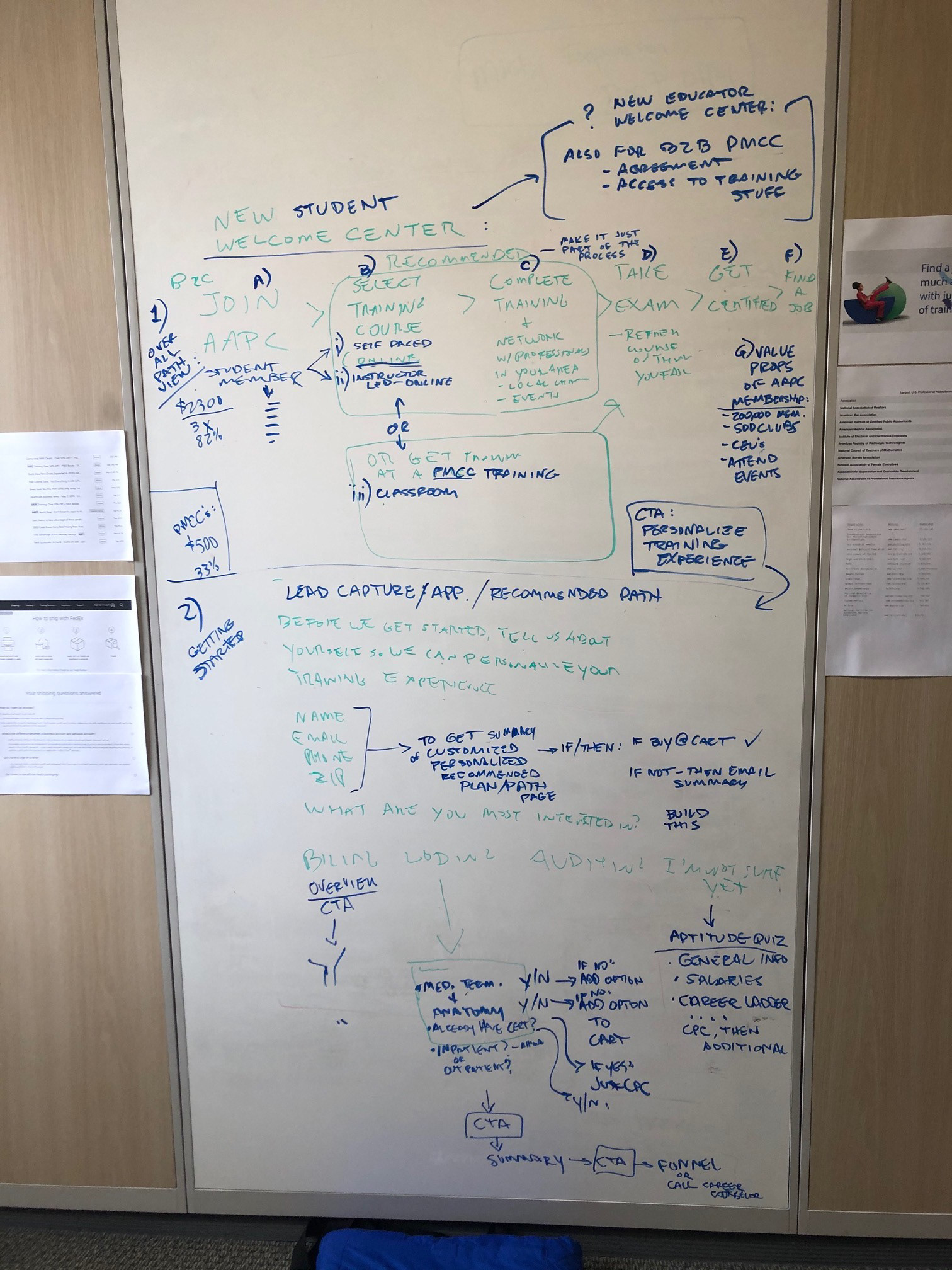
Whiteboard Explorations: The above whiteboard images illustrate early ideation and low fidelity prototyping — this involved many whiteboard sketches, tons of Post-It notes, as well as team discussions to flush out processes, organize pertinent information, and necessary user flows. These were helpful for the team to visualize current flow states. This also help us identify areas that have caused user friction, and what we needed to do to alleviate concerns in order to achieve an overall better user experience.
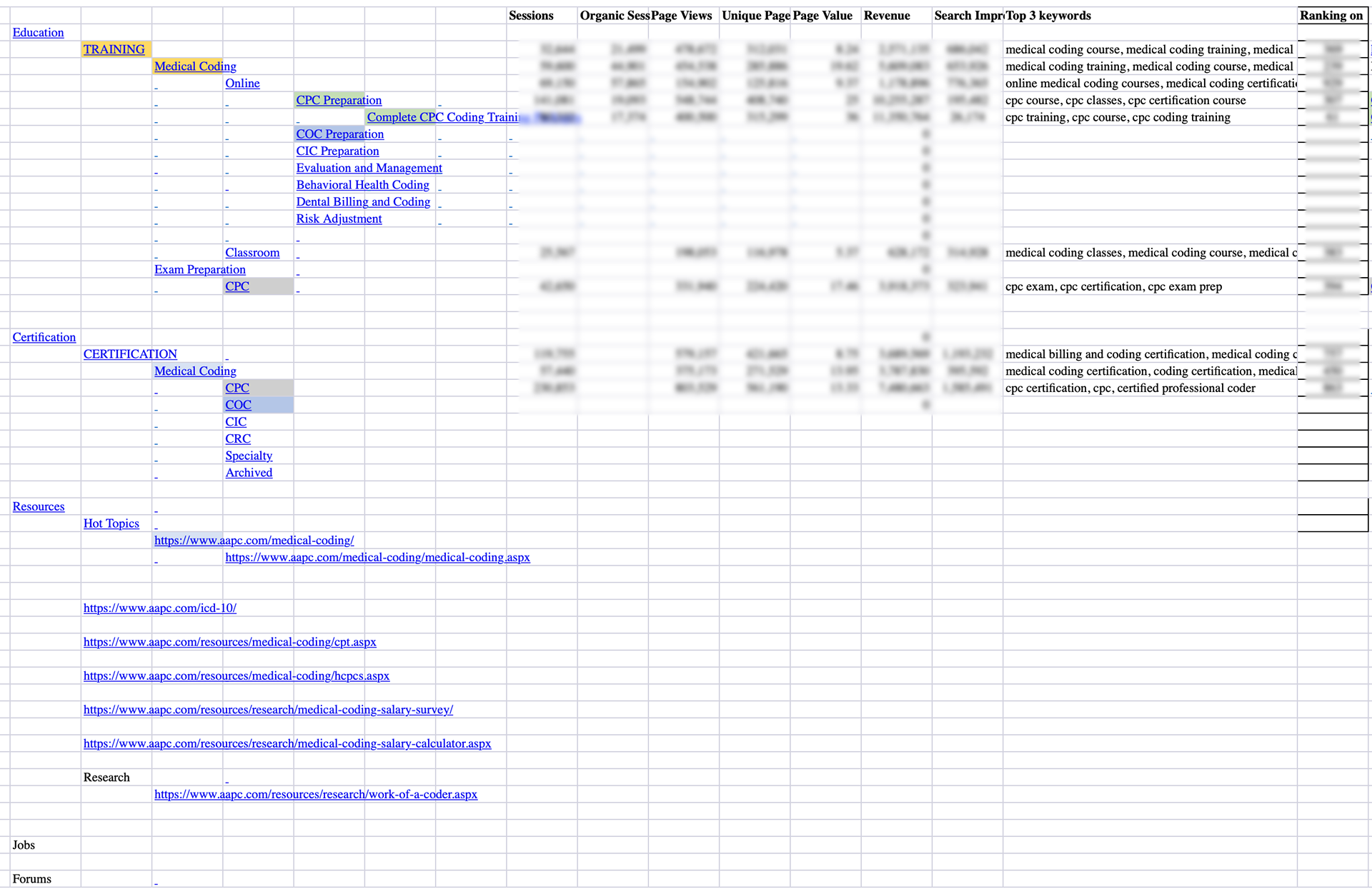
Site Map Information Architecture: The above spreadsheet shows an important UX research study aimed at identifying the major paths that web visitors to AAPC.com currently take in moving through certain marketing funnels. The key data metrics from Sessions, Organic Search, Page Views, Unique Page Views, Page Value, Revenue, and Ranking are blurred for proprietary reasons, but this data made it clear where UX / UI priorities needed to take place. Some information pages needed to be combined, some optimized, and others deleted altogether. This study also revealed areas in the funnel that were not performing as intended, which made my improvement strategies efficient.
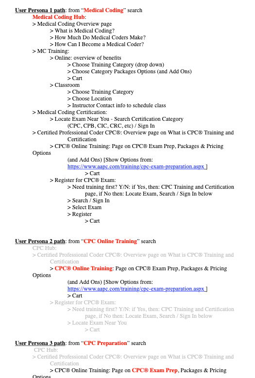
User Persona Path Optimization Study: The above clip illustrates a few of the User Personas identified and the information architecture of a user path funneled through to a checkout process via specific SEO keyword search terms. This outlined how to optimize the main and sidebar navigation taxonomy, as well as how to optimize the user experience to smoothly move through funnel pages and make effective use of our Call To Actions.
Wireframing Style Guide: I developed a style guide checklist to ensure the following priorities were implemented in the site redesign:
• It was determined that the new site needed to comply with the latest in bootstrap breakpoints for mobile responsiveness.
• An initial audit of the current site revealed that the level of ADA Standards compliance for Web Accessibility needed attention to appeal to users with visual handicaps, and reduce risk of non-compliance.
• The latest in UX Research testing and analysis guidelines for ecommerce sites needed to be added.
• A refinement of the form field structures was adopted from Google Materials.
New Student Welcome Center Process: AAPC wanted a process to help new prospects get started. I initiated a funnel setup designed to walk new students through a simple step-by-step process beginning with assessing their aptitude for medical coding, taking the results of that assessment and guiding them into a recommended certification, promoting their access to local Chapter networks by joining AAPC Membership, beginning their training, passing their exam, and getting a job.
The above whiteboard notes were a quick and easy way to brainstorm the new student welcome process.
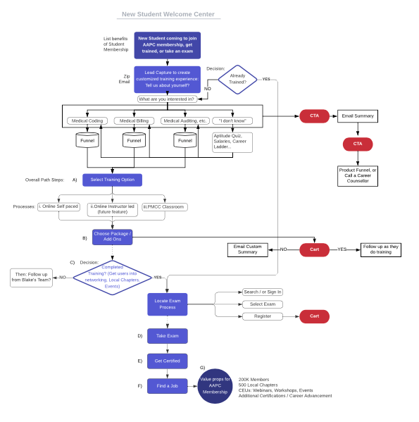
New Student Welcome Center LucidChart Diagram: The above diagram is the refined version of the whiteboard notes above. This provided me an efficient look at what pages to work on in the design phase for wireframing.
Sidebar Navigation Optimization: The AAPC site is very comprehensive consisting of hundreds of pages. The volume of webpages under management demanded an optimized look at the main navigation, sub navigation, and sidebar navigation structures. The sidebar, specifically, acted as an efficient means for user's to jump to content on one page while the sidebar remained anchored to top left.
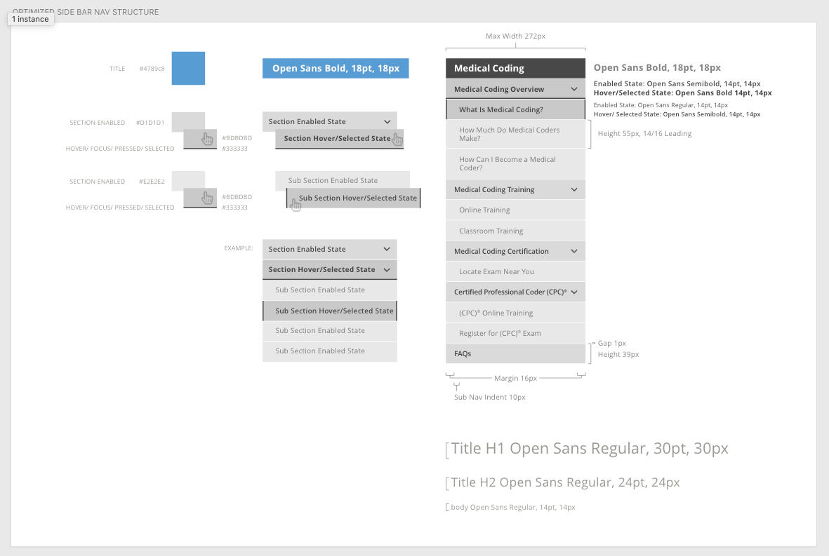
The clip above is a preliminary look at the Certified Professional Code (CPC) funnel sidebar navigation structure. This optimization was a high priority because it was the highest searched, most trafficked user request for training, and the highest revenue producing product for AAPC.
Wireframing: With all the user research, analysis, and results at my disposal I turned my attention to wireframing in Adobe XD. I kept specific design elements like color schemes and fonts neutral because we were still in the midst of the rebranding process and these elements were not ready to be applied yet. Below is an overview of many of the pages from the statement of work.


This detail shows two layouts for earlier Homepage and Mobile wireframe templates. The homepage header structure optimized search query capabilities, international language selection, contact, and account options. These were primary user needs revealed from my earlier user research. The mobile solution implemented a thumb-mapping navigation to make the user experience even easier. [at the time of posting this new brand was intentionally blurred due to pre-launch privacy.]
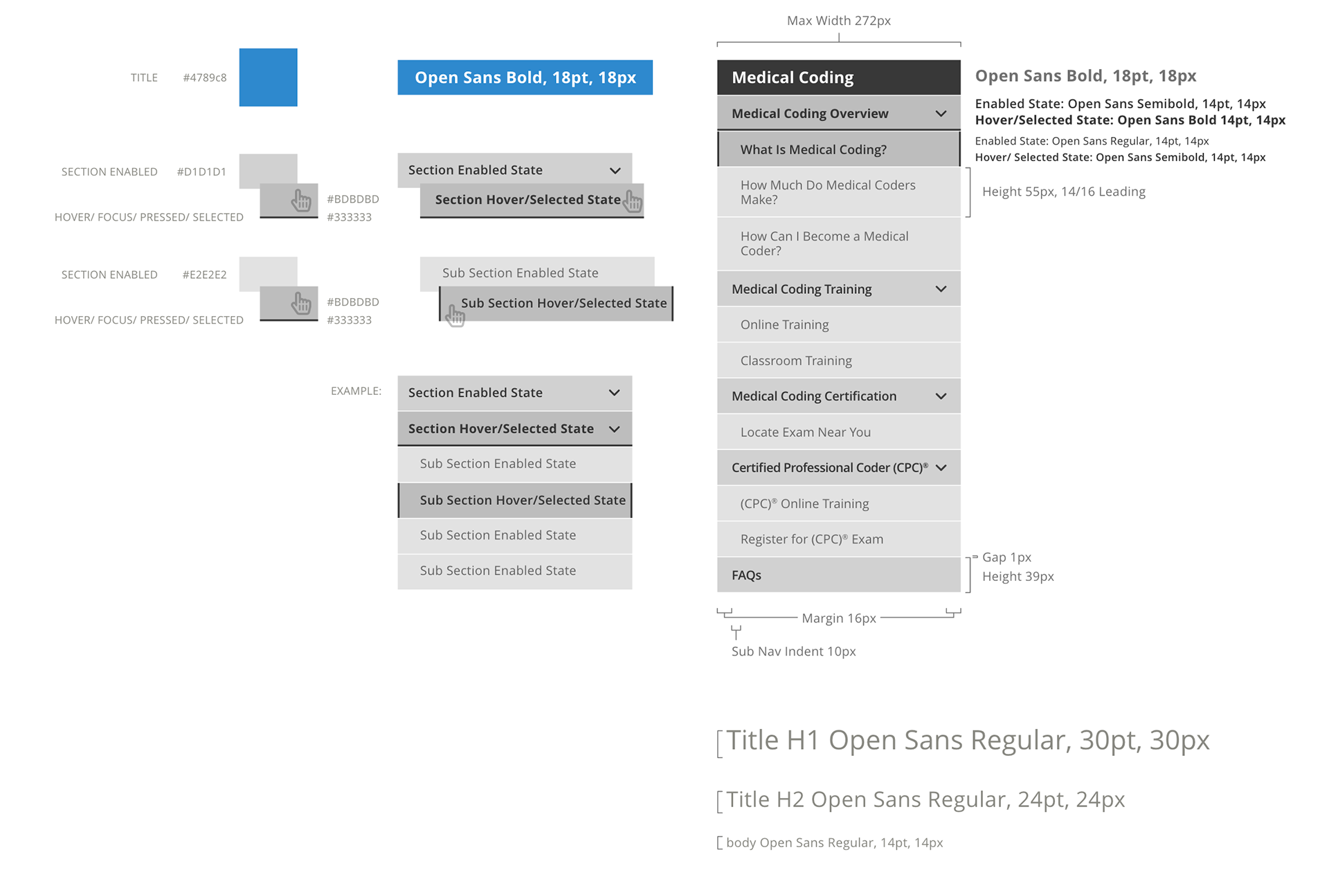
This study above shows the style guide architecture for the sidebar navigation.
In keeping with UX best practices the following Membership registration processes was designed:
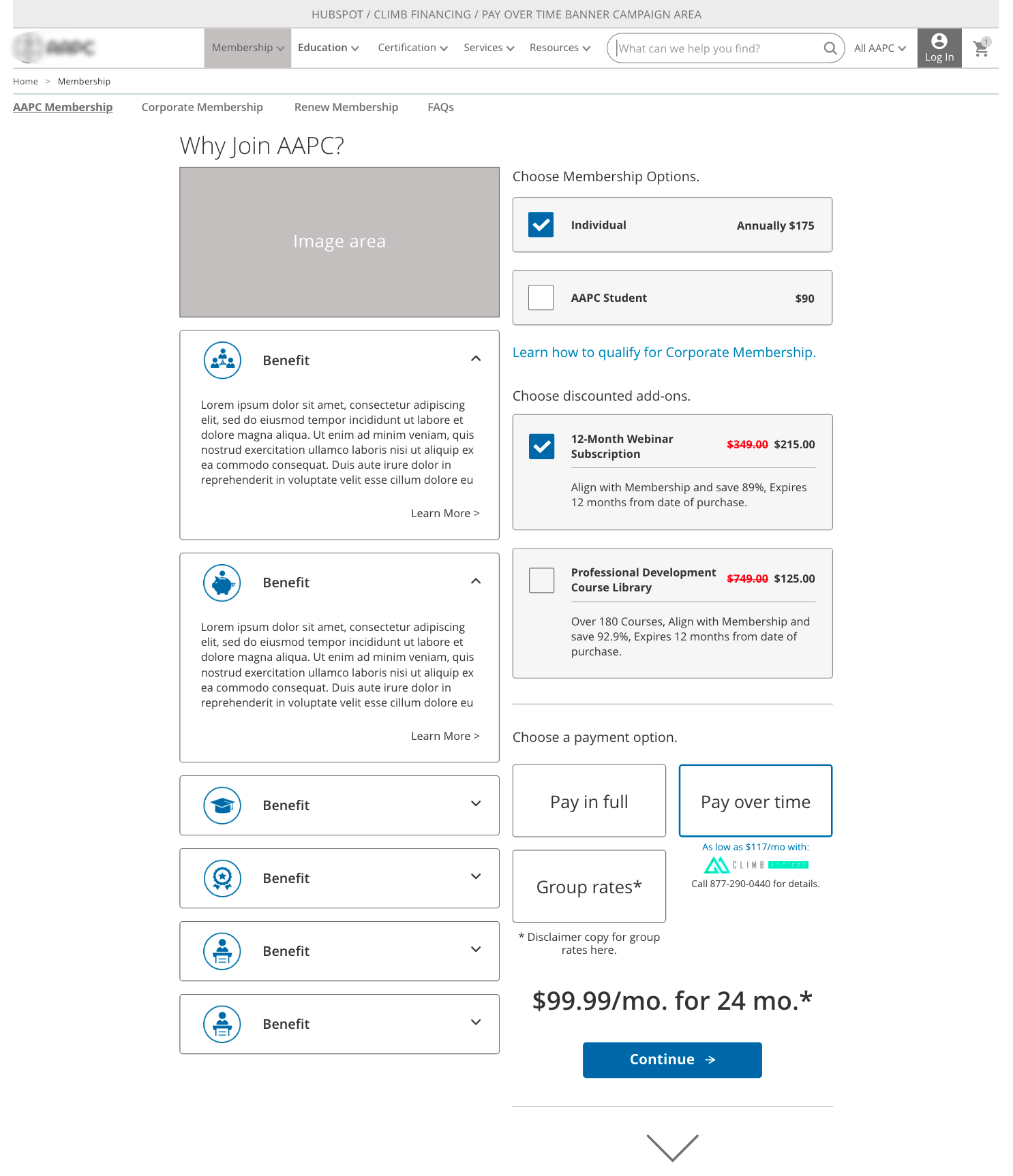
This above checkout approach allowed users to be anchored to the product and benefits on the left, while their selections on the right dynamically scrolled to each section. This kept users engaged and focused on each step until checkout.
Below is a current-state user click-rate study:
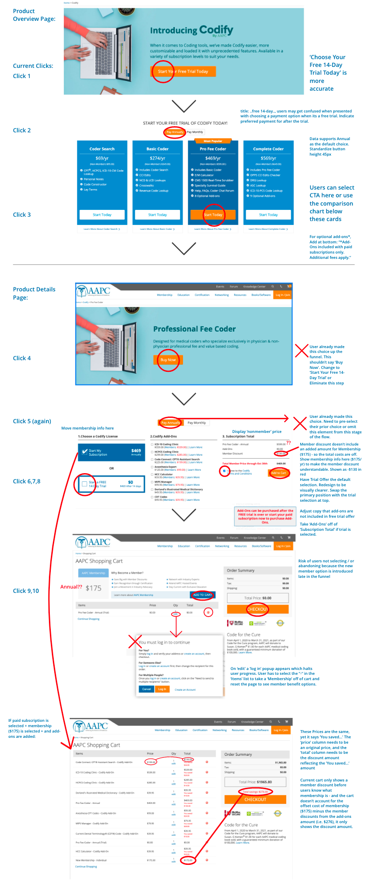
The above UX analysis outlined an unnecessary amount of user clicks (10) to select the Codify product.
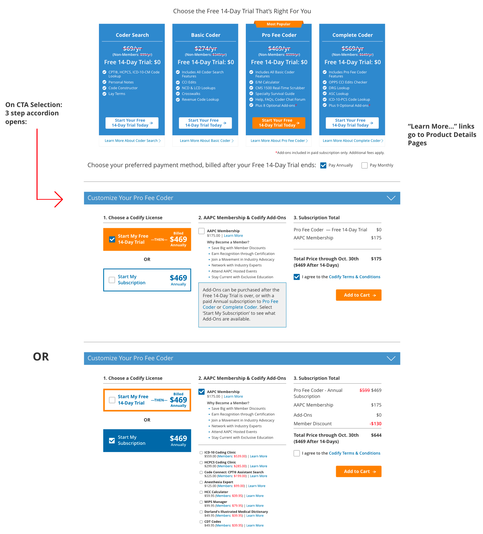
The above optimized UX solution reduced the Codify Free Trial offer process from 10 clicks to 3, enabling users to purchase the offer much more quickly. Later user study data revealed this optimization resulted in 34% increased conversion rate, and reduced abandon rates by 27%.
A current-state optimization example — Customer Service Calls:
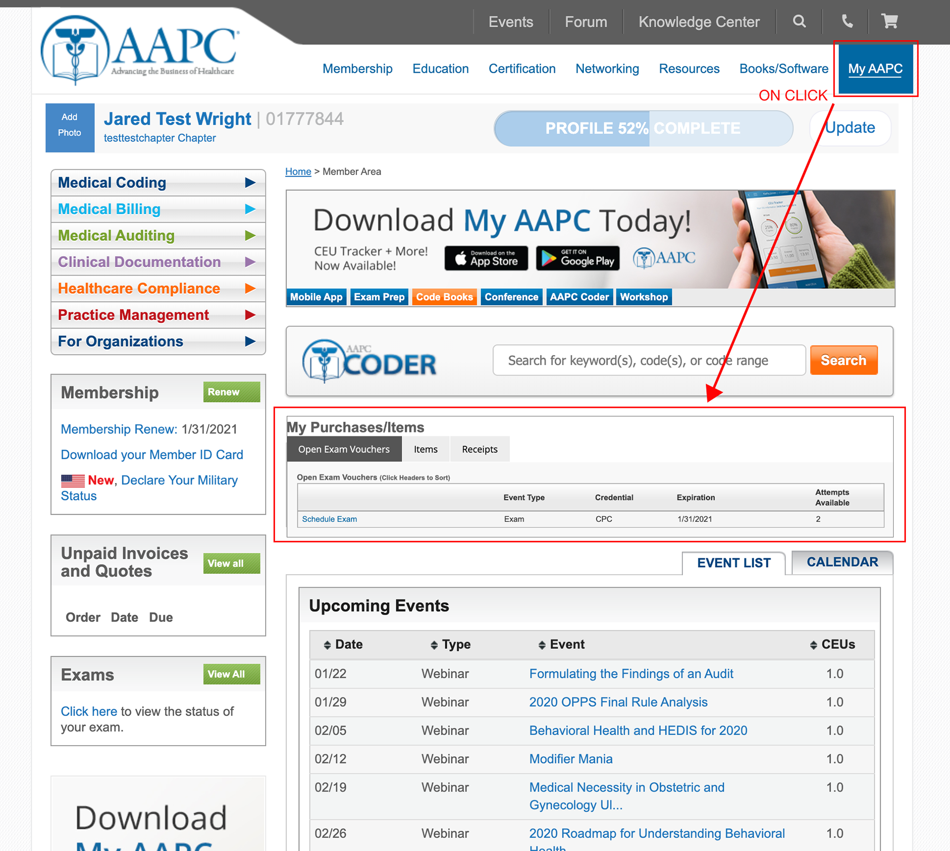
A high number of AAPC members were calling into Customer Service with a need to see their prior purchases. In my contextual interviews with reps I found this issue was occurring with daily frequency. Reps were having to instruct members through a lengthy and time consuming script to help get members to this information page. I proposed a simple optimization: create a 'My Purchases/Items' widget and move it to the login landing page dashboard. After implementation, this reduced script time to under 15-seconds, enabled reps to educate members how to find it in the future, and reduced call volume for this issue by 22% over 90 days.
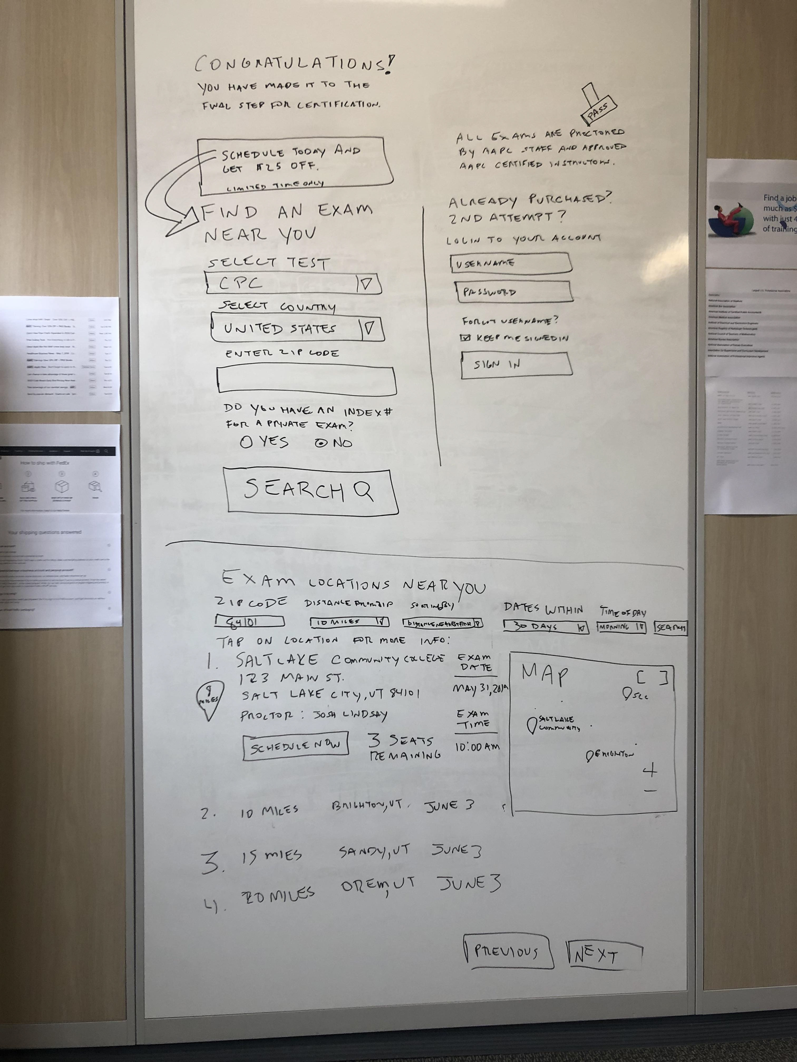
Locate Exams Checkout Process:
Another critical process that required optimization included students who had finished training and needed to locate, schedule, and register for a local exam near them.

BEFORE: This screen capture above shows the before page. The problem this created for new and returning students was no clear step-by-step advance organizer that students could reference where they were in the process, no smart defaults to use as help, no conditional logic, and a hard-to-see separated login area if a student was returning to take another exa.
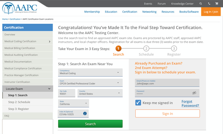
AFTER: This optimized Locate Exam process improved the forms in the following ways:
• Made a clear user path in 3 steps: Search, Schedule, and Register,
• Optimized the form fields for more intuitive states: active, focused, inactive/hover, disabled, and errors,
• Followed correct mobile markup via Google's extensively UX tested and proven Material Design guidelines (material.io),
• Included smart defaults, auto detected zip/state, and conditional logic which reduced the need for users to interact with frivolous form fields,
• Made the important distinction between new student login and returning student logins clear and simple.
Conclusion: Overall, this project set the foundations for smoother, more effective user experiences throughout AAPC's site. The optimizations made to each marketing funnel have made measurable impact to conversion rates, SEO organic search stats, and ROI revenue.