Givifi came looking for an overhaul. This involved rebranding, uniform messaging to describe their robust platform, UX/UI, web, marketing, and pitch decks. Their platform helps nonprofit organizations raise funding and support their donors with valued services. This project had to educate three distinct audiences: Nonprofit Organizations looking to raise funds, Supporters who want to champion a cause, and Retailers who want join the network. User personas were developed to help identify each of these audience's priorities. Empathy studies helped inform my design decisions.
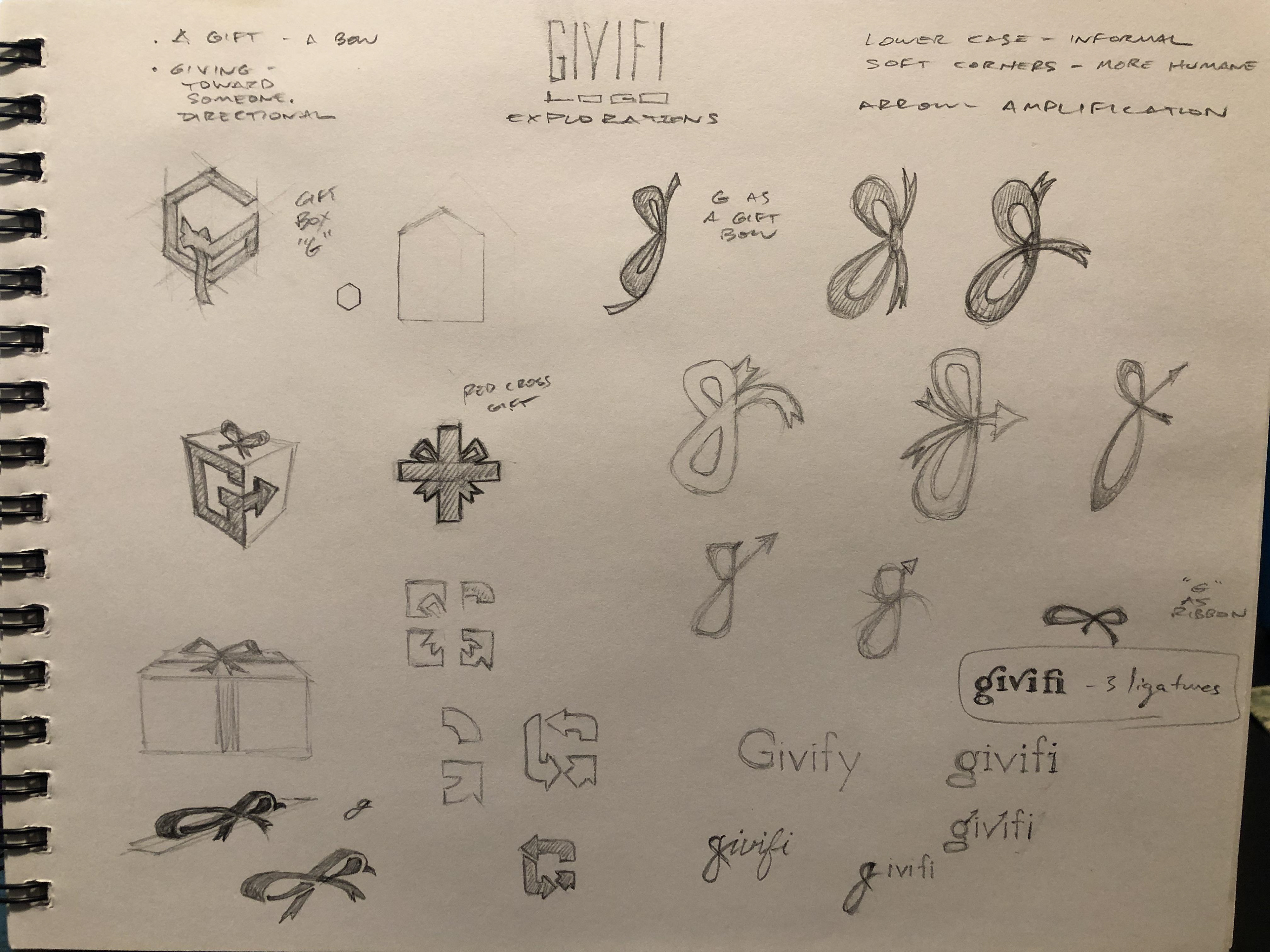
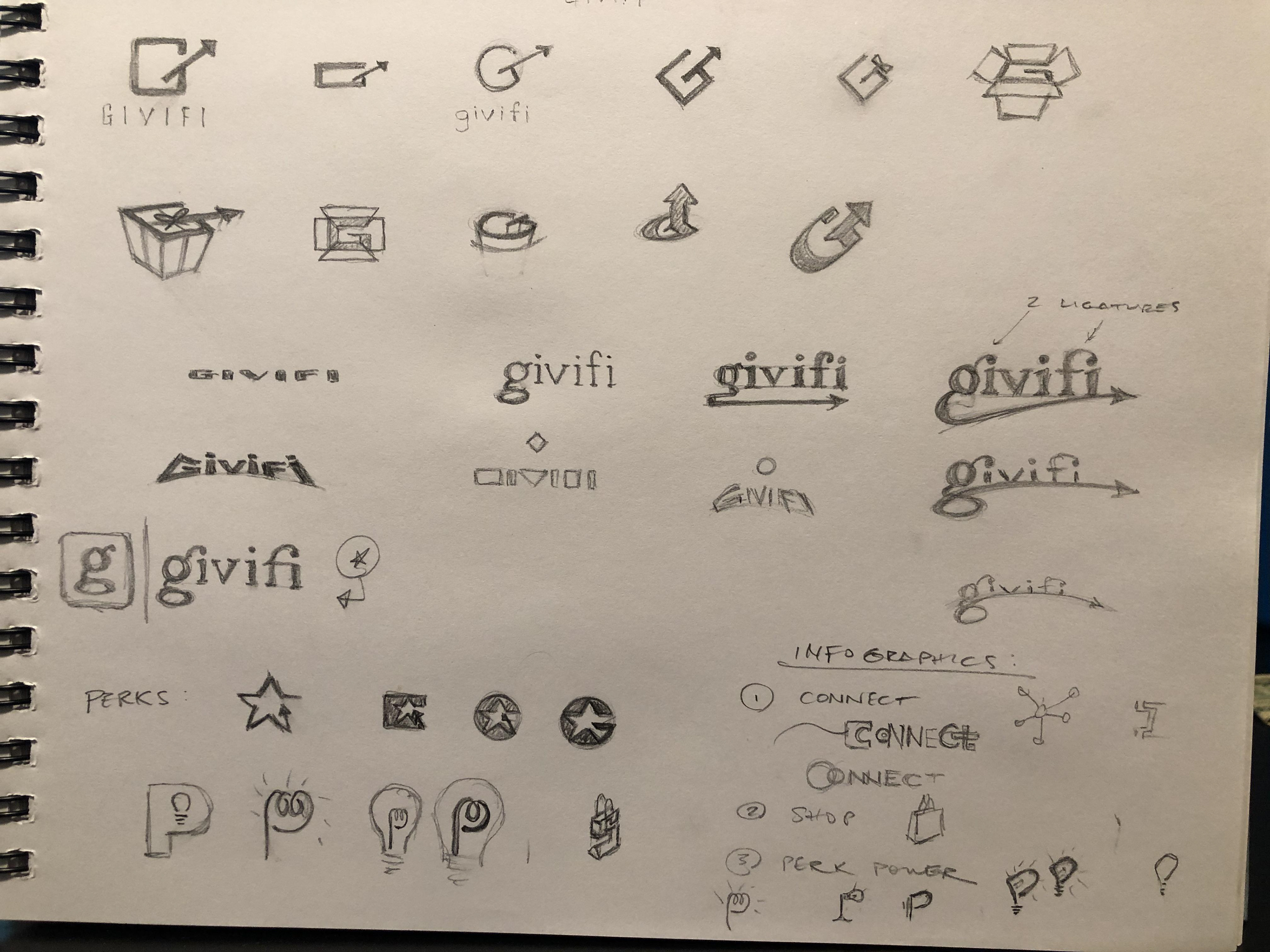
Firstly, they changed names from Savvi to Givifi. Once the client secured the name and url assets sketches ensued. Various directions explored gift boxes and gift bows. The client preferred the simpler typographic options.


I modified a typeface and incorporated two ligatures to evoke each letter 'giving' to another letter: from the 'g' to the 'i' and from the 'f' to the 'i'. Research studies showed a higher preference to a specific truer blue branding color from the original blue used by Savvi.
The website addressed each of the three audiences: Organizations, Donors, and Retailers.
In an effort to further incentivize the connection between donors contributing and corporate sponsors providing special offers, a Perks Program was created. I also designed an icon to illustrate a light bulb win/win service that everyone would benefit from.
The platform continued to expand throughout the development of the project. This $25 Gift Card offering from a partner was one of them. An informational popup needed to communicate the details quickly.
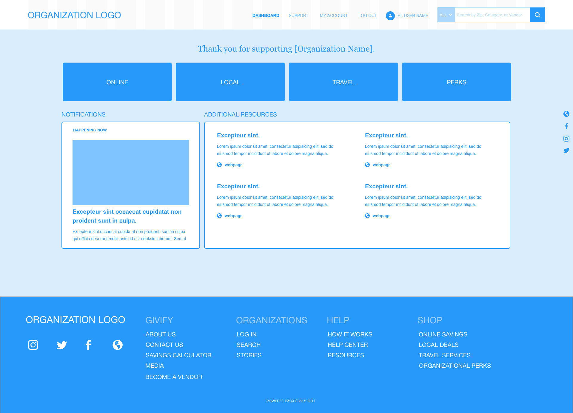
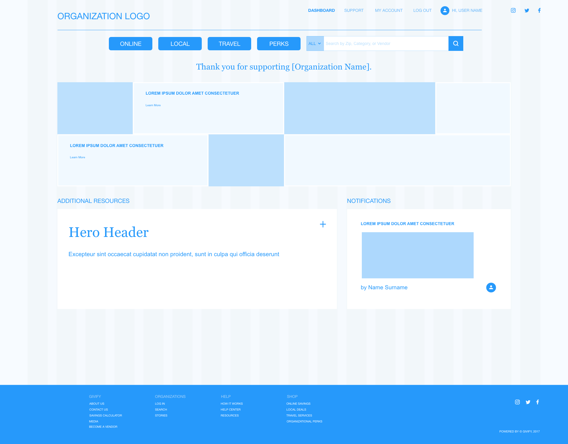
Next came exploring the needs for tiered template dashboards that organizations could choose from. These were the front facing pages to which they would direct donors and display their customized value offerings. Our studies revealed that these templates needed to be designed to showcase the following priorities: an organization's logo/branding, title statement, access to the shopping portal, social media links, blog posts, notifications, media, and social proofs. Each template also provided different layouts, fonts, and color schemes to their preference. I designed wireframes to mock up the flow of information and this gave the client and I a great place to discuss later steps.


Another priority to the new branding and website was highlighting key information about the experience, credibility, and organizational structure of the Givifi founders and team. An About Us, The Team, and Board of Advisors pages served to inform all of their audiences that they were in good hands. A mouse rollover and click revealed each team members background.
Lastly, I met with the client to galvanize this information into a pitch deck they could use to talk to nonprofit organizations. The research and discussions led to the realization that in our Socially Conscious Economy we live in today - supporters expect a recurring experience. They want to give, and feel great about it, and be involved to do it again. This was the impetus to developing a compelling message.
Overall, Givifi was equipped with powerful tools to market their platform and help nonprofit organizations nationwide better serve their patrons.