The product development team and I began with a site audit to scope the main feature priorities. From here, I developed time-to-task scenarios to perform moderated usability pre and post testing with new and veteran users. I interviewed qualified participants, scheduled recorded testing sessions, analyzed the data to identify user patterns, reviewed the resulting data with the team, and determining strategy with the product lead shareholders.
This process was essential before implementing UX guidelines and making informed design decisions about the UI redesign and wireframes.
UX Research:
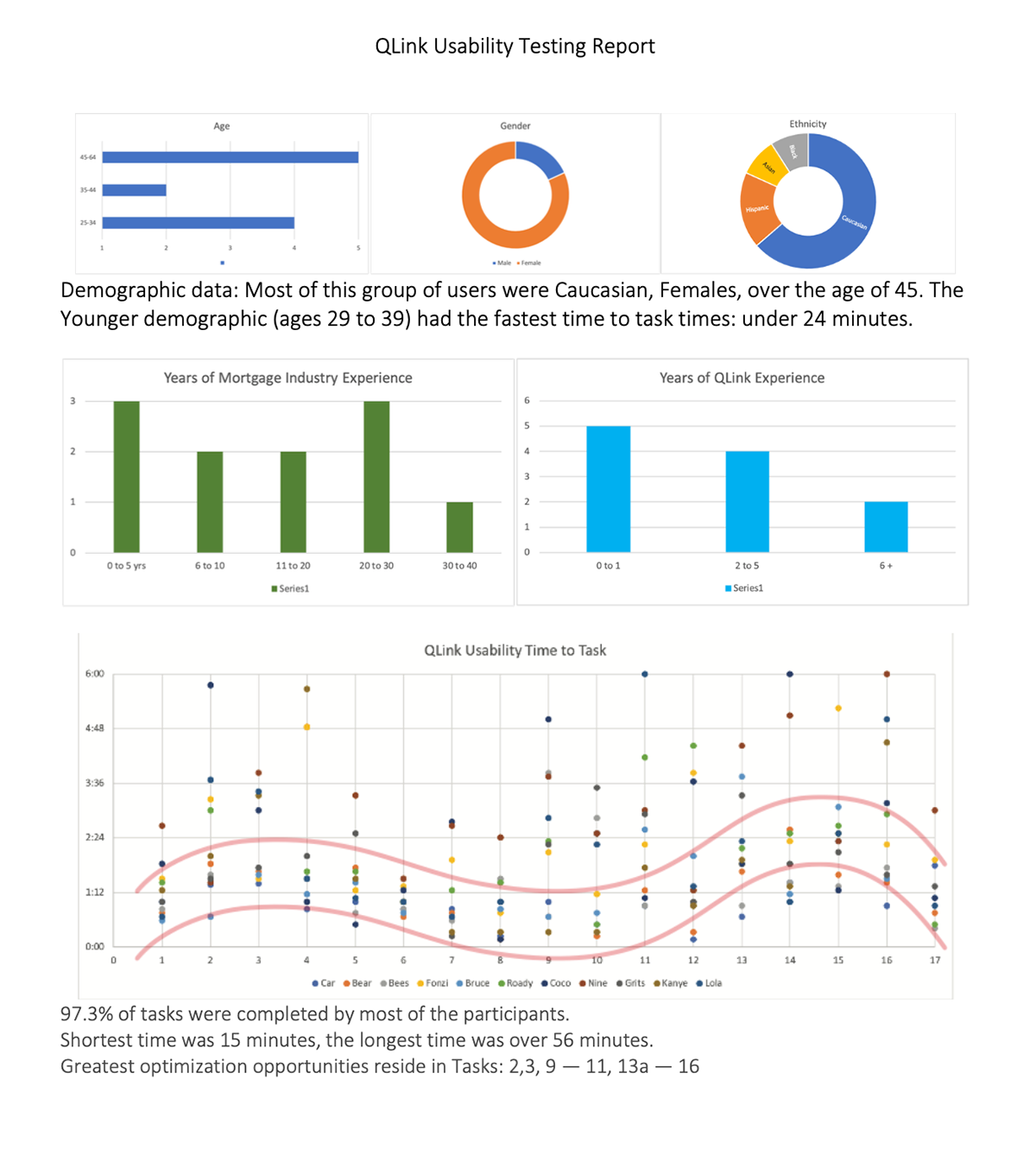
The above image is sample from my usability report summarizing user findings across all the time-to-task scenarios. This research phase revealed necessary negative elements like UI friction points, redundancies, inconsistencies, user frustrations, system-wide delays, and other opportunities to optimize the platform.

Attention was also given to a Hierarchical Task Analysis Diagram where each prioritized feature was broken down into how many steps a user was expected to take to complete a task. This helped me clearly identify where optimized UI could potentially reduce these steps and allow users to complete their work more easily and efficiently.
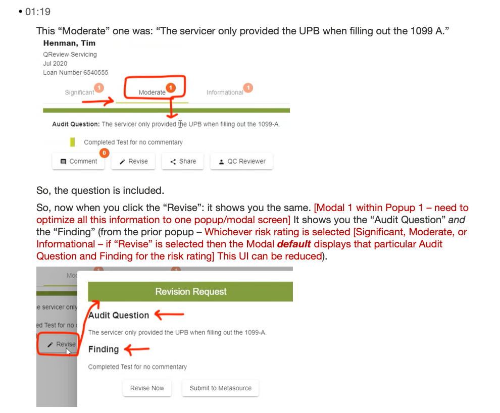
This snippet is from a transcribed usability testing session with a user. I noted an optimization opportunity to simplify the risk rating process on a Mortgage loan. This reduced user's cognitive load in finding information, and reduced the user's time having to make manual adjustments.
Wireframing:
This phase involved taking the current QLink navigation tree (which involved complex primary, secondary, tertiary, and even quaternary nav systems - more like a nav forrest than a tree) and optimizing the entire user experience based on the priority user task data.
This encompassed a new Home Page dashboard display of user-customized data visualizations, a Loans page, a Findings page, a Shared Findings page, and simplified popups / modals.


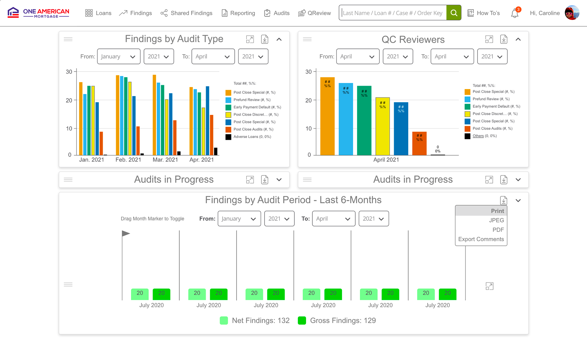
Home Page: This new dashboard design displayed the client's logo, a fixed main navigation, a prominent Search field with smart AI to recognize and autocomplete various query entries, and the user's account information. I retooled their existing data visualization pie charts to a more comparative, more contrasting side-by-side bar chart view. This dynamically displayed the key and the sorted the data by highest to lowest percentages.
User testing data also informed us that they wanted the ability to download these data visualizations for their own reports, so this feature was added.
Current truncated data pie chart design (left) — Redesigned to side-by-side bar chart (right):
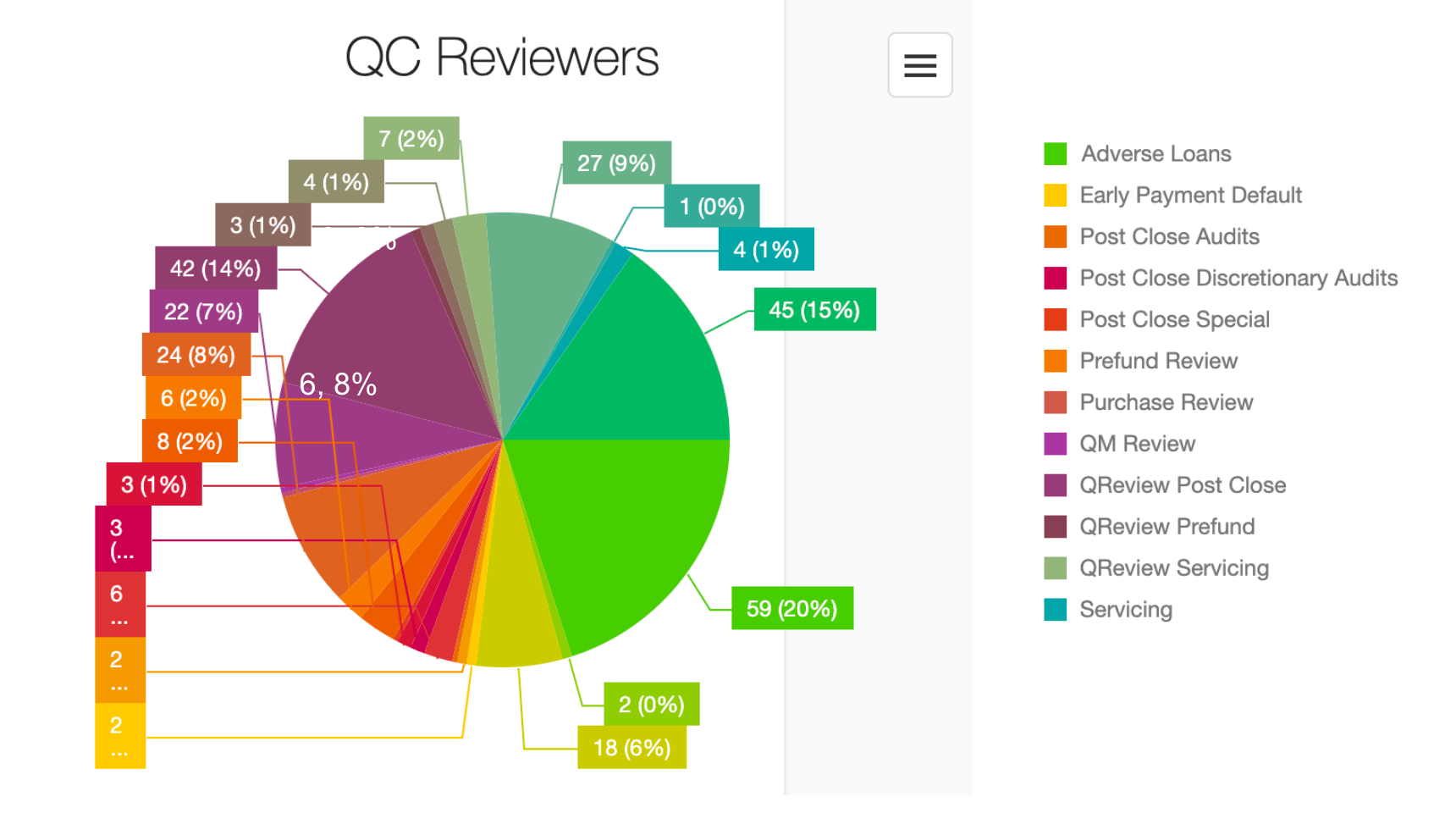

The prior data visualization above showing QC Reviewers on the left created a number of problems:
1) too many colors in the chart and the key made it impossible for users to compare color to data tags,
2) truncated data completely compromised the integrity of the pie chart, and
3) they didn't include redundant data tags in the key to make up for truncating data in the pie chart.
The redesign template to the right added the ability for users to adjust the graphing period by time on the y-axis. By dynamically reducing the color-safe color scheme key and adding data tags to the key - users were assured they could see important data. I also added other necessary features: drag and drop grabbers, expand graph, download graph, and collapse graph icons. And in the event a title tag was too long to fit in the key space and truncation occurred - the title would truncate, not the meta data tag.

Loans Page: This page involved creating a persistent filters & categories side-bar nav that engaged users in dynamically updating their search queries (also reflected in the dynamic breadcrumbs at the top). This made Quality Control team member work flow exponentially more efficient.
The split screen also allowed users to see the Loans list to the left and the selected Loan details to the right.

Findings Page: This page had to incorporate a sub nav element that assisted users in further filtering the Findings spreadsheet view. It was important to allow users to customize their view by column location, by saved template name, by sorting, by pinning, and by unique column search.
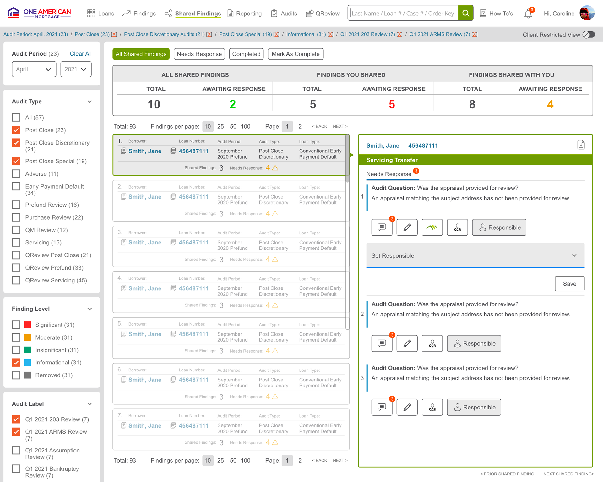
Shared Findings: Some QC team members only had limited permission rights which meant their loan file views were limited to only loans shared with them. This view allowed those users to respond to certain aspects of the loan quickly and intuitively.
Conclusion:
This project respected the user experience by incorporating their pre and post usability testing results. This, along with implementing proven UX best practice guidelines, resulted in informed design solutions that made the MetaSource QLink platform perform 67% better in user satisfaction, 33% reduction in customer service call times, and an overall more effective product.